Hi! In this blog post I will talk a little bit about a new image I made. If you want to know more about how I did that, do read along! I will talk about the thought process, my methods and do a little bit of shameless plugging as well.
Now let's get started !

I decided that I wanted to paint a cuddly bird reading under a tree. I had 'some' idea what that would look like. In order to make the idea a little more substantial, I would start by looking for real world images that inspire me.
The importance of using reference images is critical to develop an idea. I encourage everyone to spend a good amount of time on this part, as it will help you get a clear idea what you actually want to paint.
While browsing through Google's vast collection of peaceful nature photography, I found a bunch of images that really did it for me. Sometimes you find exactly what you're looking for. But other times you have to follow a trail of breadcrumbs, so to speak. Knowing the exact names or descriptions of objects and situations will save you a lot of time.
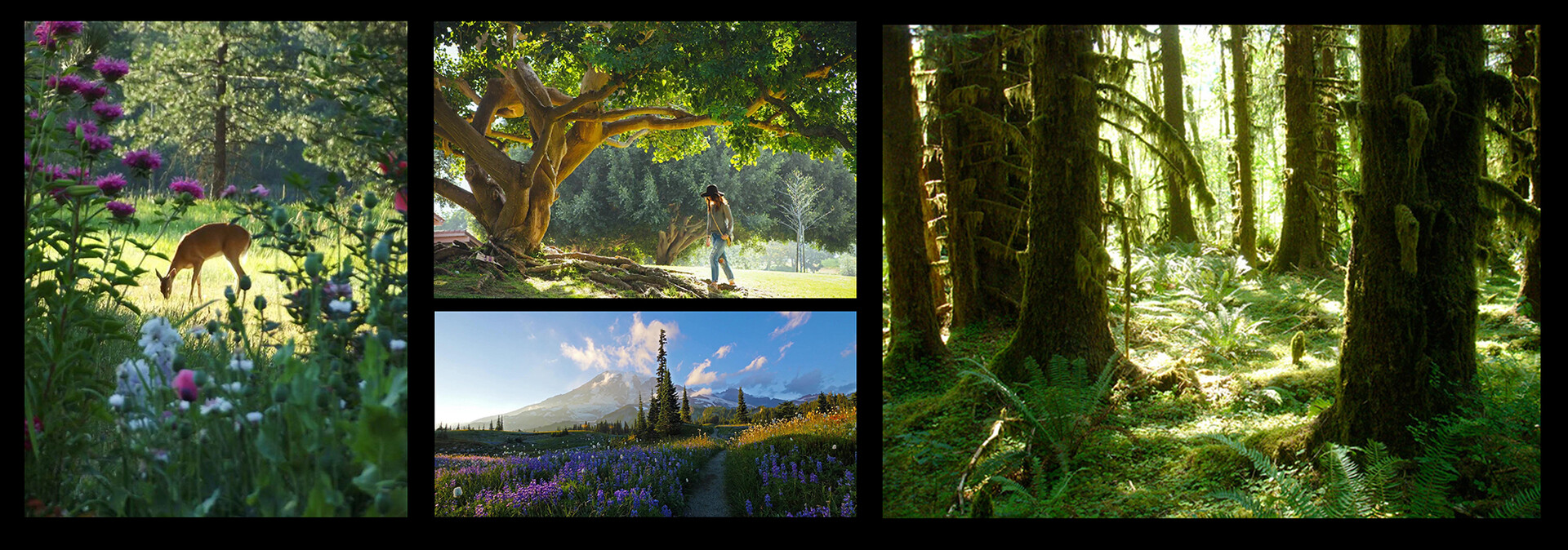
You can experiment with the search engine by opening new images into new tabs, or right-clicking an image and select 'search the web for this image'. Also, by opening images that might not necessarily be what you need, you will definitely come across stuff that sparks an alternative idea or lead you in a new search direction. This eventually will lead you to a treasure trove of cool reference images or waste a bit of time.
You have to be a bit strict on yourself and try to focus on the initial idea. Google, especially Pinterest, can lead you through a maze of cool images that will distract you.
I tend to search for very specific keywords and phrases. 'Dappled light' was one of the successful search queries, and led to me a variety of new search terms. It's good practice to organize your idea into key words that you could search for.
Also be sure to organize your search results into specific folders such as 'style', 'lighting' , 'colours' , 'mood', and so on. This narrows down your search and makes sure you stick to the essence of your idea.
I made three different versions based on a specific set of references images for each idea.
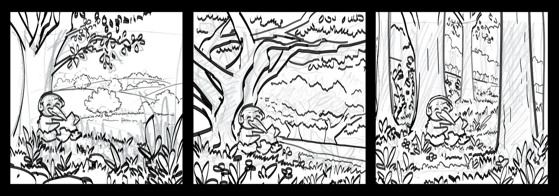
I wanted to paint in a Ghibli / Lofi art style, so I looked up more reference for this. I divided my scene into clear foreground, midground and background sections, gave them a flat colour and then went about painting the various parts.
My inspiration came from the works of Sylvain Sarrailh https://www.artstation.com/tohad and Mathias Zamęcki https://www.artstation.com/mathiaszamecki. I just love the colourful, painterly images they create. Be sure to check these guys out! They have some really great work, and show you how they do it as well.
I was really fond of the grass brush tutorial that Mathias made, which can be found at https://www.youtube.com/watch?v=oTwL8zZA8kw You can see how I used the brush in the foreground of my finished image. Another super useful find was the cutout / shapes pack by Sylvain. These are hand painted bush PNG files that you can drag into your painting. They come as coloured versions, black silhouettes and as custom shapes. Obviously I had to experiment with them. I think they really brought my image to life! Check out the pack for yourself at https://www.artstation.com/a/2365569
Another amazing brush pack inspired by Ghibli can be found here : https://www.artstation.com/a/2936660 It's got a whopping 128 brushes for Photoshop and Procreate. It comes with videos and some example paintings!
After the first few hours, I had set up the basics for the image and took a break. I came back and immediately saw that the colours were not exactly popping. It's good to get a fresh perspective on your work. I spent more time tweaking values, moving layers around, playing with adjustments layers, adding Shape Blur or Gaussian blur filters and detailing.
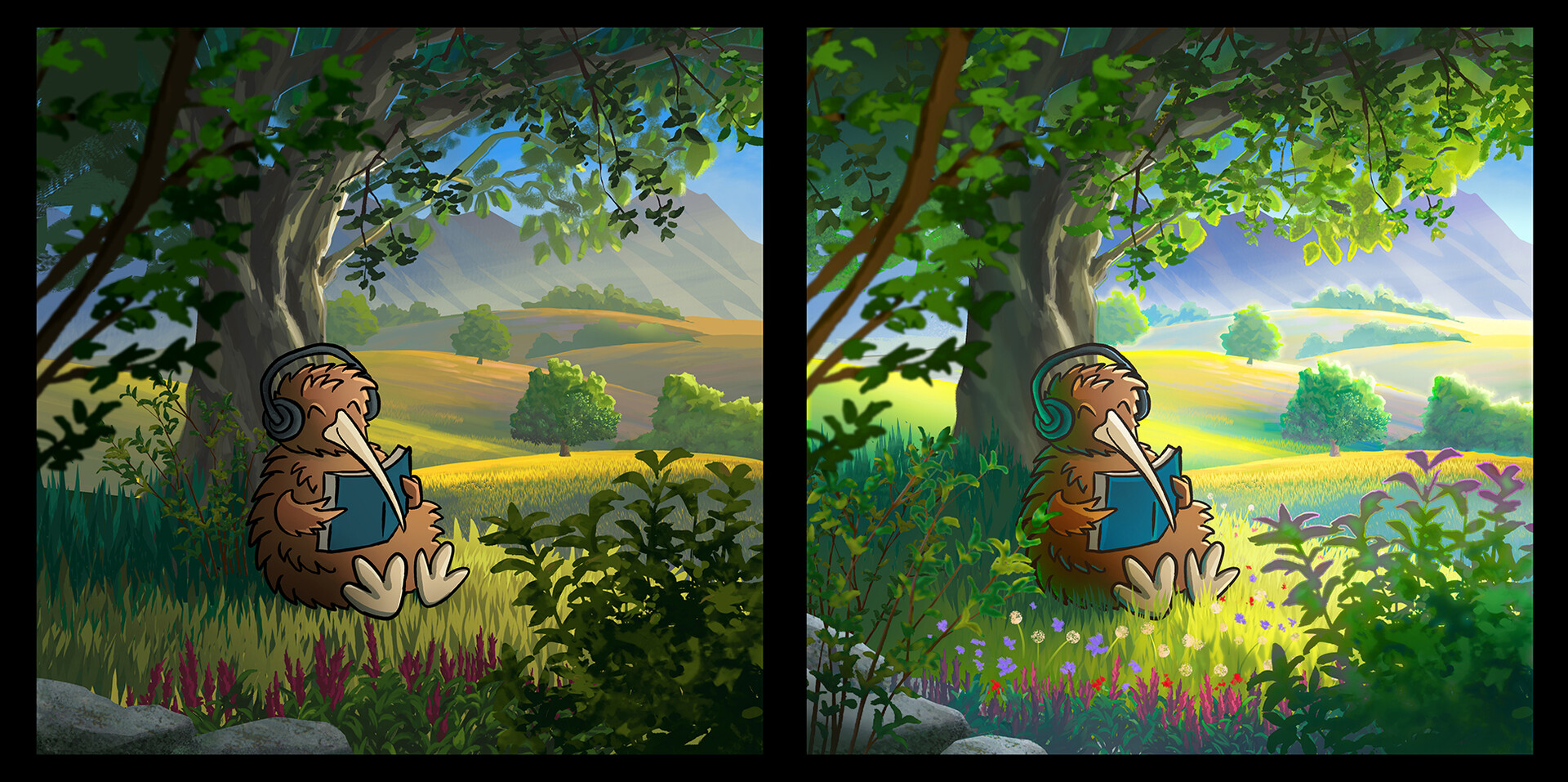
Looking back, I definitely feel that using the store assets really speed up the process. It wouldn't make sense to put these all over the place, but instead place them at interesting points to bring the scene to life! I definitely want to use them a bit more in different sketches later on.
I also learned that taking your image, messing with layer adjustments and filters can really push the style further. I quite like how the lighting in the background has turned out on the trees. I experimented a lot with selections, masking and layer effects, which is something I'm fairly new to.
I hope you enjoyed this little blog post. If you want to stay up to date to more art, be sure to follow me on https://www.instagram.com/michielvdheuvel/ or https://www.facebook.com/vdheuvelmichiel/